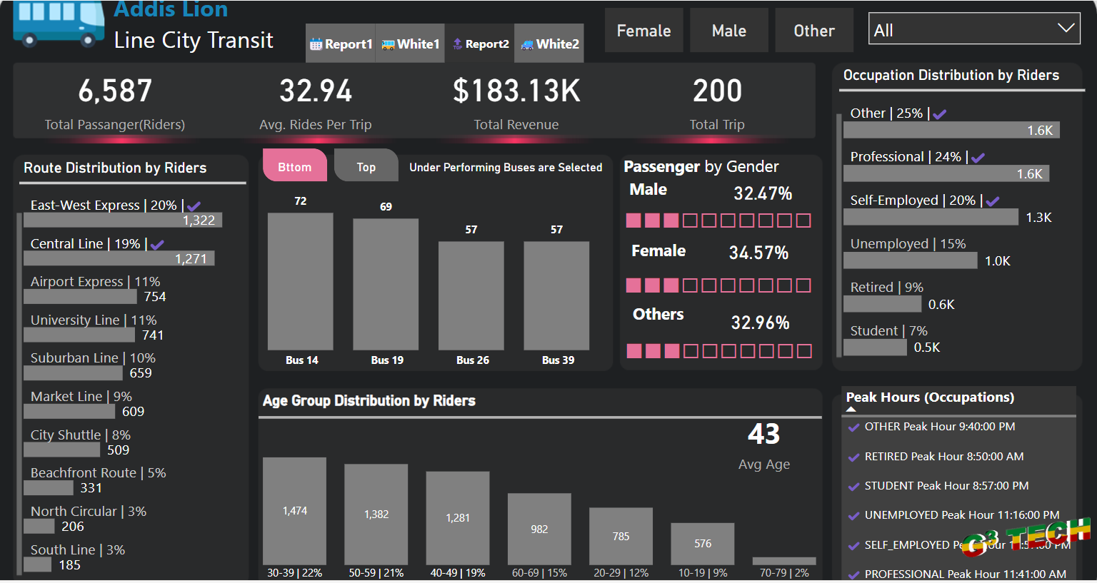
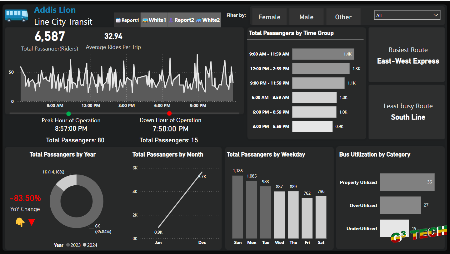
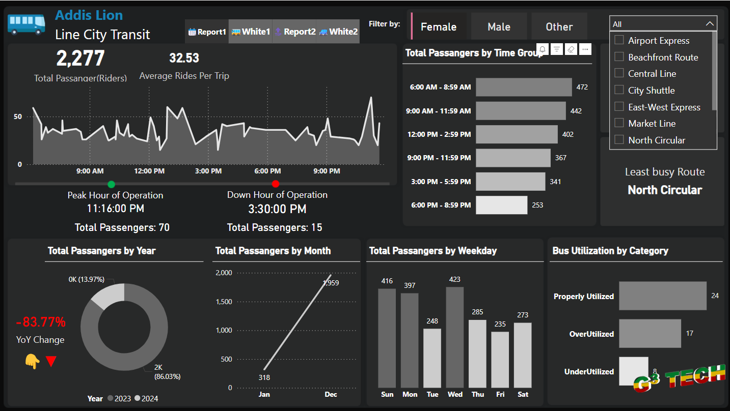
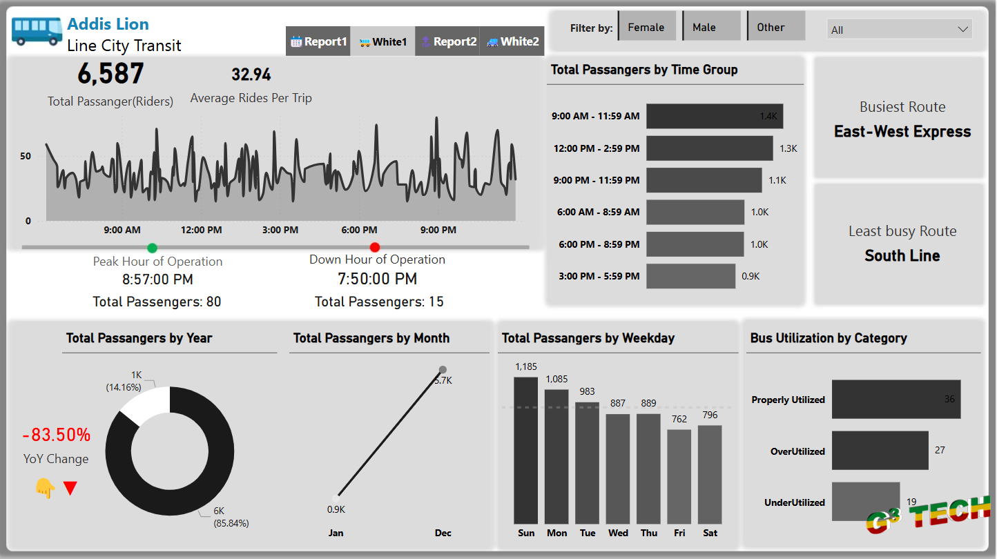
Analyzing public transportation data is vital for optimizing transit operations and enhancing rider experience. Power BI provides a comprehensive platform for visualizing and analyzing transit data. Here’s an overview of a city bus transportation dashboard created in Power BI, showcasing key metrics and insights.
Key Metrics and Insights
1. Overall Transit Performance:
- Total Passengers: Shows the total number of riders, indicating the volume of usage across the transit system.
- Average Rides Per Trip: Provides insights into the average number of rides per trip, helping to assess bus occupancy and efficiency.
- Total Revenue: Highlights the revenue generated from transit operations.
- Total Trips: Displays the total number of trips made, offering a snapshot of transit activity.
2. Route Distribution by Riders:
- Popular Routes: Break down the percentage of riders using each bus route, identifying the most and least popular routes. Key routes include the EastWest Express, Central Line, and Airport Express.
3. Top Performing Buses:
- Bus Performance: Lists the top performing buses based on the number of riders, helping to identify which buses are most utilized.
4. Passenger Demographics:
- Gender Distribution: Shows the distribution of passengers by gender, providing insights into the gender composition of riders.
- Age Group Distribution: Analyzes the age distribution of riders, with the average age and breakdowns across various age groups.
- Occupation Categories: Highlights the distribution of riders by occupation, including professionals, self-employed individuals, unemployed, retired, and students. This helps in understanding the occupational demographics of the transit users.
6. Peak Hours by Occupation:
- Peak Travel Times: Identifies peak hours for different occupational groups, offering insights into when various groups are most likely to use transit services.
Insights and Recommendations
1. Route Optimization:
- Improve and expand services on popular routes like the EastWest Express and Central Line to accommodate high demand.
2. Bus Utilization:
- Analyze the performance of top buses to ensure they are well maintained and efficiently utilized, possibly reallocating resources to underperforming routes.
3. Targeted Services:
- Consider tailoring services and schedules to better meet the needs of the predominant rider demographics, such as professionals and students.
4. Marketing and Outreach:
- Develop targeted marketing campaigns to attract more riders from underrepresented demographics or occupations.
5. Operational Efficiency:
- Use peak hour data to optimize bus schedules and reduce congestion during high usage times, improving the overall rider experience.
Summary
The City Bus Transportation Dashboard in Power BI provides a powerful tool for analyzing transit data across multiple dimensions. By leveraging these insights, transit authorities can optimize routes, improve service quality, and enhance the overall efficiency of the transportation system. Explore the dashboard to gain deeper insights into your transit operations and drive better decision-making.
If you have any questions or need further details, feel free to comment below. We are here to help you make the most out of your transit data.
We have made the source code available for download. You will be able to access it once you have logged in. Please log in to download the source code.


